Respect-Code
successfully led the redesign of the platform in 3 stages.
01 The Product
a platform ensuring transparent communication of consumer products to transform supply chain data into credible consumer-facing stories.
02 The Challenge
redesigning the platform and primarily enhancing the experience on mobile devices, and finding one solution that will bring “custom or premium clients” together to one unified platform. Up until this point the premium brands required separate custom platform solutions.
03 My Role
04 What I Accomplished
05 Research
Stage 1
User interviews
Interview goal 1
Interview goal 2
Interview goal 3
Results
With all of the insights from the interview goals, and analysis of all of the different custom platforms, I noticed a pattern that kept coming up. The pattern had a repeated use of sections that were different but had similar purpose and mostly usage of color accents to connect with the brand identity of the client.
Solution
The solution was very simple, I proceeded with designing sections that will be easily reusable for every client need (build as one platform) by using the tool “Contentful” in which without code our internal CSM teams can build these platforms with ease without need of additional developers and designers for every platform, using the pre-defined sections.
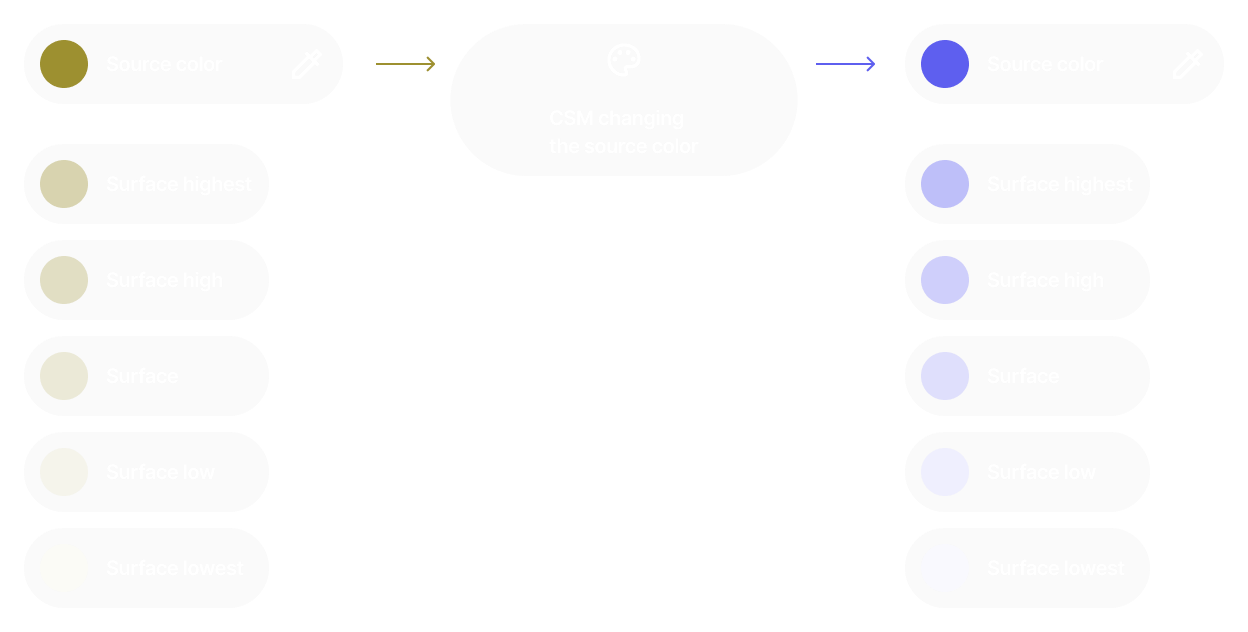
For the branding part I created a simple color theme that can be adjusted in Contentful to match the clients branding and Font themes with type-scale that is reusable but also can be personalized by changing the font family, that will achieve the look of the clients branding.
Result
The solution was very simple, I proceeded with designing sections that will be easily reusable for every client need (build as one platform) by using the tool “Contentful” in which without code our internal CSM teams can build these platforms with ease without need of additional developers and designers for every platform, using the pre-defined sections. For the branding part I created a simple color theme that can be adjusted in Contentful to match the clients branding and Font themes with type-scale that is reusable but also can be personalized by changing the font family, that will achieve the look of the clients branding.
For the branding part I created a simple color theme that can be adjusted in Contentful to match the clients branding and Font themes with type-scale that is reusable but also can be personalized by changing the font family, that will achieve the look of the clients branding.
06 Wireframes
building the sections: from wireframes to polished UI
Reusable sections


Improving the navigation
07 Color Theme
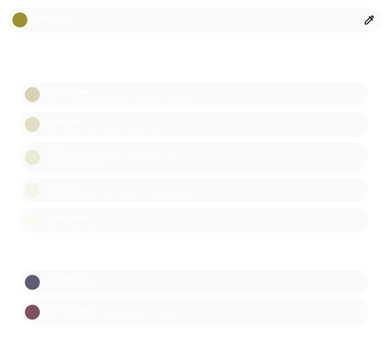
Building the color theme
08 Stage 1 - redesign
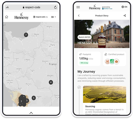
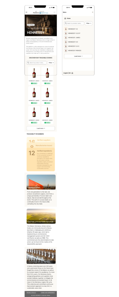
Example of the final redesign of the transparency platform of HENNESSY.
Reusable sections
09 Secondary Reserach
Assumptions
Testing against the assumptions
10 Ideation & alignment - stage 2
Quick wireframes
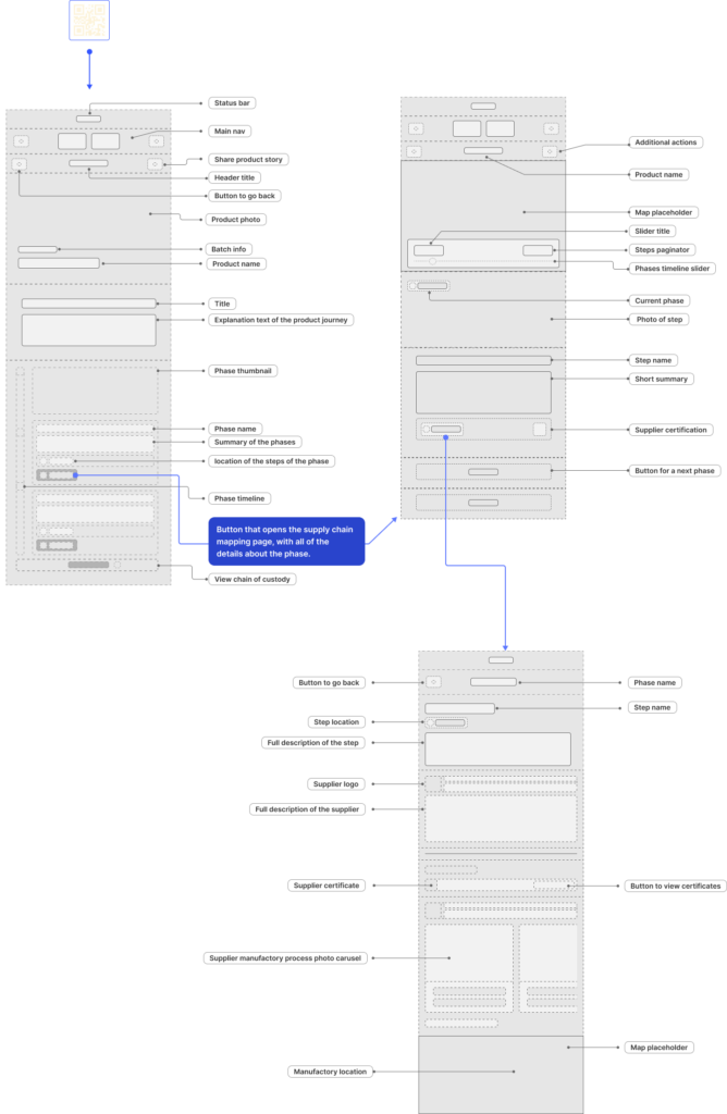
11 Final Polished UI
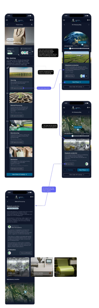
After a few alignments and iterations, I arrived at the final polished design, which seamlessly integrates the storytelling component with the more technical and in depth supply chain analysis.
The idea was to start with one source color that can be adjusted to any color that would match the brand, and then using that source color to apply it on different surfaces with different opacity levels (from highest surface to lowest). Also adding accent color into the theme.